POS Interface Theme
A POS (Point of Sale) Theme refers to the visual design and layout of the user interface on a POS system. This includes color schemes, button styles, fonts, and overall aesthetics that make the interface user-friendly and visually appealing. For example, many POS systems allow you to customize the display theme to suit your preferences or brand identity. You might have options to switch between light and dark modes, adjust the layout, or even add custom graphics.
1. Steps to create a POS Theme
You can create a POS Theme using the Theme Builder. You can access the Theme Builder from the POS Settings section on the POS Profile Creation Screen. The steps to create a POS Interface Theme are explained below:
Step 1. Navigate to Home > Retail. Under the Settings section click on the POS Profile shortcut. This should take you to the POS Profile Creation Screen.
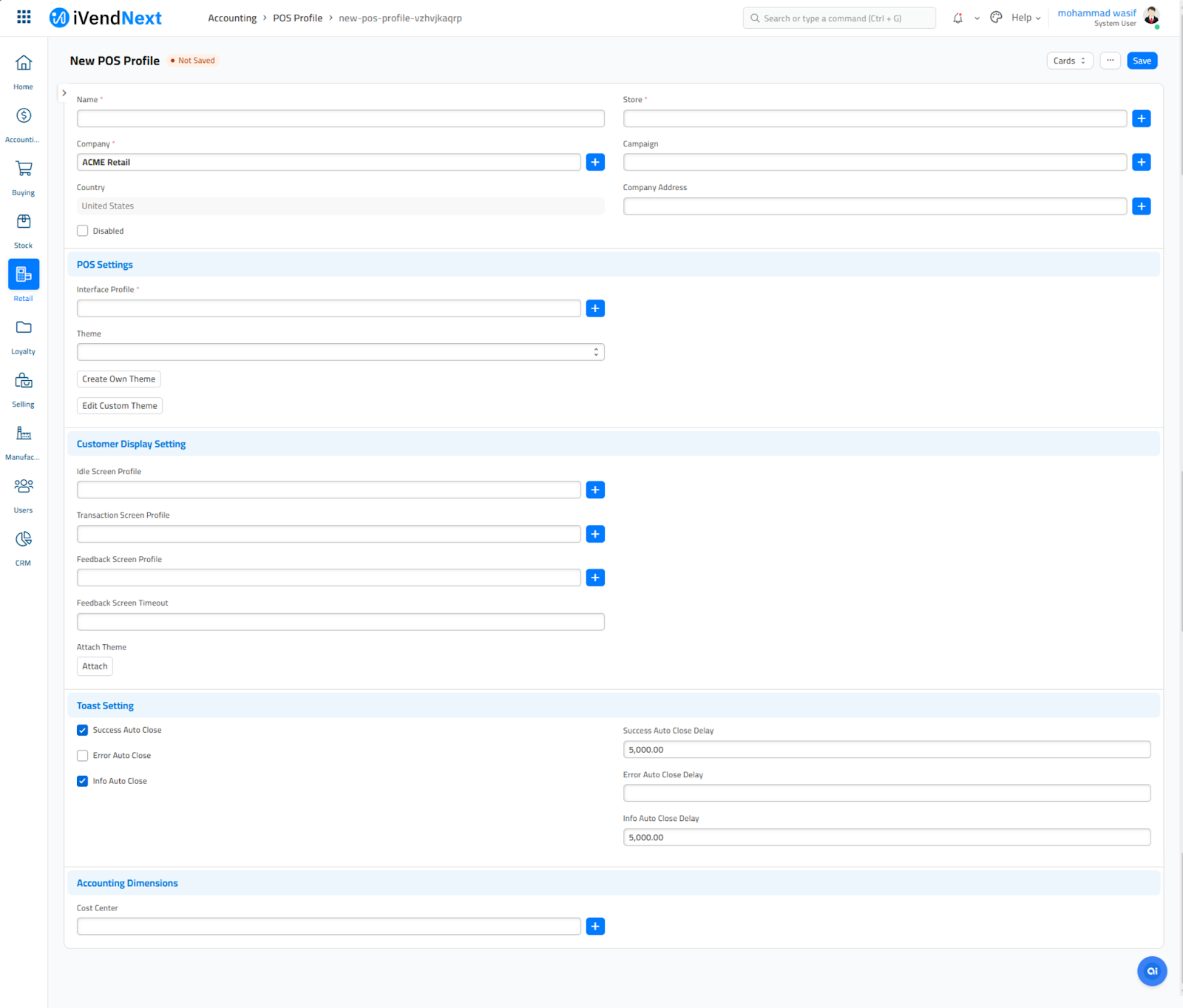
Step 2. Click on the Create Own Theme button to open the Theme Builder screen. All the settings pertaining to the graphical layout of your POS Theme can be configured from this screen.
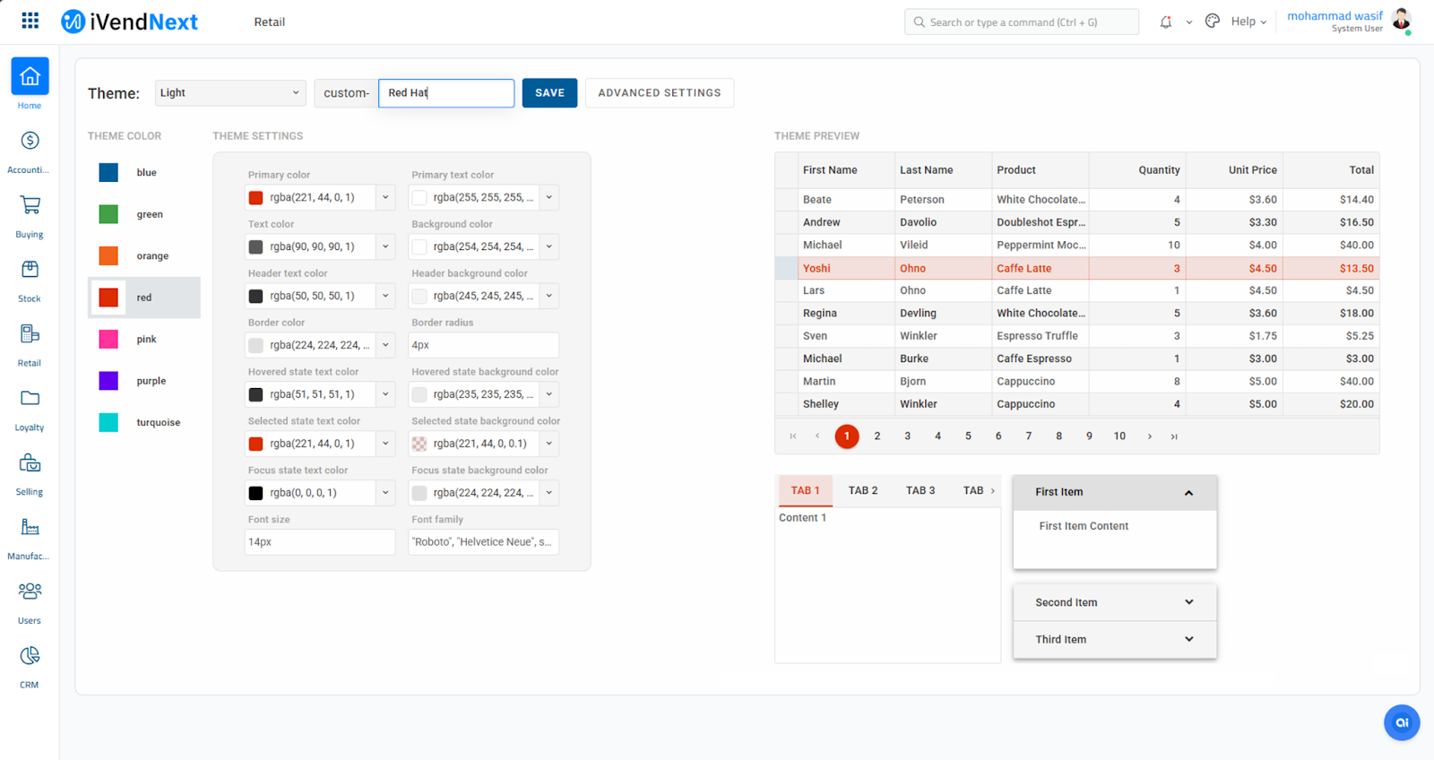
Select the Theme Mode - Dark or Light
Specify the Theme Name.
The Theme Builder has 3 broad sections:
-- Theme Color
This section lets you choose a color from the blue, green, orange, red, pink, purple, and turquoise color options.
-- Theme Settings
This section lets you choose a color for your text displayed on the screen.
-- Theme Preview
This section lets you view the changes made to the theme real-time.
Click the Save button to save the changes and exit the screen.
2. POS Theme Builder Screen
The various fields displayed on the POS Theme Builder screen are explained below:
Primary Color:
Base color used for prominent UI elements like buttons and highlights.
Primary Text Color:
Text color that appears on elements styled with the primary color.
Text Color:
Default color for general text across the POS interface.
Background Color:
Overall background color for the POS screen or container.
Header Text Color:
Color of text used specifically in header sections or titles.
Header Background Color:
Background color used in the header area of the POS interface.
Border Color:
Color applied to the borders of elements such as buttons and cards.
Border Radius:
Defines the curvature of element corners; higher values mean rounder shapes.
Hovered State Text Color:
Text color when the user hovers over an interactive element.
Hovered State Background Color:
Background color that appears on hover for buttons or list items.
Selected State Text Color:
Text color for currently selected or active items.
Selected State Background Color:
Background color for selected states like highlighted tabs or menu items.
Focus State Text Color:
Text color when an input field or interactive element is focused (clicked or activated).
Focus State Background Color:
Background color shown during an element's focus state, such as a highlighted field.
Font Size:
Sets the size of the text across various UI components.
Font Family:
Specifies the typeface used in the POS interface for text rendering.
3. Suggested Theme Values for Retail POS
Let’s design a POS theme that’s not just functional—but visually satisfying and retail-ready.
Suggested Theme Values for Retail POS
Here's a sleek and readable preset you can customize further in iVendNext's Theme Builder:
Setting | Suggested Value | Why It Works |
|---|---|---|
Primary Color | #007bff | A vibrant blue for clear call-to-action buttons. |
Primary Text Color | #ffffff | White text on blue ensures maximum readability. |
Text Color | #212529 | Deep gray for a clean, professional feel. |
Background Color | #f8f9fa | Light gray keeps the UI spacious and calm. |
Header Text Color | #ffffff | White stands out on dark headers. |
Header Background Color | #343a40 | Rich dark gray for a modern retail header look. |
Border Color | #ced4da | Subtle border that defines sections cleanly. |
Border Radius | 6px | Slight roundness for friendly UI shapes. |
Hovered State Text Color | #212529 | Consistent readability on hover. |
Hovered State Background Color | #e2e6ea | Light hover effect for subtle interactivity. |
Selected State Text Color | #ffffff | Highlights selected items with clarity. |
Selected State Background Color | #007bff | Keeps selection consistent with primary styling. |
Focus State Text Color | #212529 | Ensures input field clarity while typing. |
Focus State Background Color | #cfe2ff | Soft blue helps users identify active fields. |
Font Size | 16px | Optimized for readability across devices. |
Font Family | Roboto, sans-serif | Modern and retail-friendly font pairing. |
Disclaimer: The suggested theme values provided above are intended for general guidance and illustrative purposes only. Individual business needs, branding requirements, and user experience goals may vary. We recommend testing visual elements across devices and consulting design best practices before finalizing your POS theme in iVendNext.